Banking App UX improvements
Smoother Money Transfers: Removing friction points in new-contact flows
The Challenge
Our client engaged us to run a parallel design sprint alongside their in-house team, delivering an independent perspective and targeted, data-backed recommendations to optimise the money-transfer experience. Their app was already a performing well, but internal usability testing and analytics highlighted friction points when users were adding and transferring money to new payees:
- Only 61% of new-payee transfers were completed in under 60 seconds (vs. 89% for repeat payees).
- Only 52% rated the new-payee experience “very smooth” (vs. 89% for repeat transfers)
- Disruptive full-screen 2FA modal that broke flow after contact entry
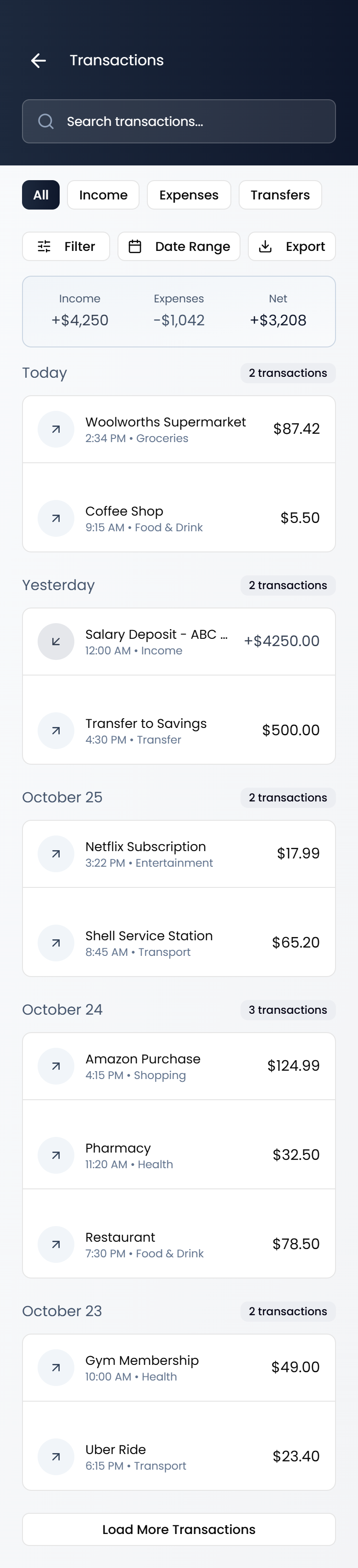
- Transaction history buried behind navigation, forcing users to leave the transfer screen to double-check past payments
The client provided us with rich prior research (heatmaps, session recordings, 200+ usability-test clips, and quantitative funnel data) so we could focus purely on designing and validating targeted solutions.
Business Goals (set by client)
- Raise new-contact transfer by 20% - 30%
- Reduce time-to-complete transactions by 10–20%
- Cut related support tickets by >15%
- Keep security-perception scores unchanged
What We Did
Discovery & Synthesis
- Deep-dive into the client's existing research library and Amplitude funnel data
- Mapped top three friction points and prioritised them with the product team
Design & Prototyping
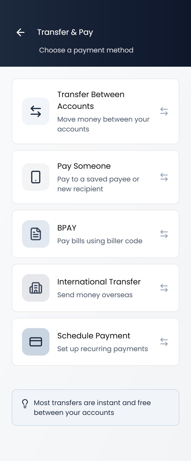
- Consolidated contact addition + verification into a single progressive screen
- Embedded predictive transaction search and "recent activity with this contact" directly in the transfer preview
- Delivered a pixel-perfect, clickable prototype mirroring the bank's design system
Final Deliverables
- High-fidelity prototype ready for user testing.
- Annotated flow documenting every decision tied back to the client's original research
- Before/after comparison deck used by the bank's product team to secure final stakeholder sign-off (Origional screens have been withheld to protect the client's privacy.)
Design Process
View initial wireframes through to high-fidelity greyscale designs
Results (Client-Measured 30 Days Post-Launch)
Key Learnings
Even small interruptions in an otherwise good experience create measurable difficulties. Working from a client's existing, high-quality research let us move fast and deliver precise, low-risk improvements with outsized ROI. In future engagements of this type, we'd allocate even more time upfront to co-creating the success-metric dashboard with the client's analytics team to streamline post-launch measurement.